A vegan nail polish blog. A celebration of colour and light, as well as of justice for nonhuman animals.

Posts tagged ‘blue’

Holiday Nail Art Challenge Week 3: Decorations!

It’s the third and final week of Nail Polish Canada’s holiday nail art challenge, and the theme for the week is “Trim the Tree – Holiday Decorations”! My partner and I like to celebrate the ancient Roman holiday of Saturnalia at this time of year. Did you know that decorating trees and hanging wreaths and holly, along with a fair number of other modern-day Christmas traditions, originally came from Saturnalia celebrations? 😀

Since yesterday was the first day of Hanukkah, I also “threw caution to the wind” and added a menorah to my holiday nail design. Well, both are festivals of light after all, although the ancient Romans and Jews were at war off and on between 66-136 CE and the Jews didn’t exactly come out on top in those conflicts… :/ Anyway, I hope you can all forgive this atheist’s multi-cultural multi-faith holiday mani. 😉

I’m a bit late in posting this; I did the design and took the photos last night, and meant to post earlier today, so by now there should be another candle lit on my menorah!

Saturnalia and Hanukkah decorations mani

The sun is a major symbol of Saturnalia, which was celebrated around the winter solstice (the dates and length of the celebration varied what with changes of the ancient calendar) when the days are the shortest in the northern hemisphere. Sun symbols were one of the main ornaments used to decorate trees, and so I wanted to have the sun figure prominently in my mani.

Saturnalia and Hanukkah decorations mani

This web page compiles a few modern-day celebrants’ comments about Saturnalia, and I thought I’d post an excerpt that has to do with decorations:

“Many of the decorations involved greenery – swathes, garlands, wreaths, etc – being hung over doorways and windows, and ornamenting stairs. Ornaments in the trees included sun symbols, stars, and faces of the God Janus. Trees were not brought indoors (the Germans started that tradition), but decorated where they grew.

Food was also a primary decoration – gilded cakes in a variety of shapes were quite popular, and children and birds vied for the privilege of denuding the trees of their treats. The commonest shapes were fertility symbols, suns and moons and stars, baby shapes, and herd animal shapes (although, to be honest, it’s hard to tell if some of those ancient cookie cutters are supposed to be goats or deer). I would imagine coins were also a popular decoration/gift.”

Saturnalia and Hanukkah decorations mani


“People were just as likely to be ornamented as the trees. Wearing greenery and jewelry of a sacred nature was apparently common, based on descriptions, drawings, and the like from the era. Although the emphasis was on Saturn, Sol Invictus got a fair share of the revelry as well.”

Saturnalia and Hanukkah decorations mani


“Gold, because the sun is yellow, is always a sure choice for a good Saturnalia decoration. For modern Saturnalia, those golden glass ball ornaments are ideal, as are gold sun faces, gold stars, and gilded anythings. Gilding nuts and pine cones and nestling them among the swags and wreaths of greenery would be a lovely way of acknowledging the ancient roots of this ceremony.”

Saturnalia and Hanukkah decorations mani


“Indoor trees are not ancient Roman, but if you have plants growing indoors, decorating them would certainly be in the spirit of the holidays. If you just have to have the now-traditional indoor tree, try decorating it in gold ornaments with a solar theme. Swathe it in bright red or purple ribbons (2 colors quite in favor with the Romans, and looks great with the gold ornaments). Top the tree with a sun, rather than a star, for after all, this is a solar celebration.”

Items used for Saturnalia and Hanukkah decorations mani

Here are the items I used for this mani. The base polish is Zoya Indigo, a shimmery navy blue with very fine, sparse holo particles. The boughs of holly were made with Zoya Rina and Kleancolor Metallic Red. The menorah was drawn using the orange Orly striping polish, which is called Lovey Dovey. The sun, the candles, and accents on the holly were done using some metallic gel pens. The sun’s face was done using the silver gel pen but then traced over with a regular blue fine felt-tipped pen, since the silver didn’t contrast well enough against the yellow.

I had a lot of fun doing this three-week holiday challenge! Be sure to visit the week 3 nail art challenge page here and vote for your favourite holiday decorations mani! Voting is open through December 12th. And whatever you celebrate at this time of year, I hope you have a wonderful holiday! 😀

Orly Synchro

This is a very picture heavy post, because this polish is quite the chameleon! Orly Synchro is from the Electronica collection released for early fall 2012.

Orly Synchro

It’s a duochrome shimmer that is kind of frosty. The colour ranges from coral to pink to purple to nearly blue, depending on the angle.

Orly Synchro

The formula was a bit thick and sticky; not the easiest to work with. Care also has to be taken to get the brush strokes straight.

Orly Synchro

It’s also pretty sheer, and this was three coats, the last one thick.

Orly Synchro

Totally worth it though! The colours are amazing! It makes me think of a sunset.

Orly Synchro

Orly Synchro

Orly Synchro

Orly Synchro

In the shade:

Orly Synchro

I also swatched it using one fairly thick coat over black (one coat of Kleancolor Black). The layer on my ring finger somehow ended up being thicker than the others, and it shows in the photos; the ring finger has more of a pinkish-purple tone while the other fingers show off the more blue side of the polish.

Orly Synchro over black

Orly Synchro over black

I found the trick to applying Synchro to be using a thick enough final coat that you have time to straighten out the brush strokes before it starts to get sticky.

Orly Synchro over black

I just love all the colours in this! And how it looks quite different over black versus on its own!

Orly Synchro over black

Orly Synchro over black

Orly Synchro over black

In the shade:

Orly Synchro over black

On my thumb in this last photo is one coat of Synchro over a light pink (Joe Fresh in the shade Blush):

Orly Synchro over black and pink (thumb)

Holiday Nail Art Challenge Week 1: Snow!

I recently got an invitation from Nail Polish Canada to participate in a holiday nail art challenge contest they’re holding. This is week one of three, and the theme for the week is snow! Something I’m glad to say we haven’t really had much of here yet – it was snowing off and on today actually, for the first time of the season, but it didn’t accumulate at all. 🙂

Orly Au Champagne and Zoya Twila

Here is my snow mani – the base is two coats of Orly Au Champagne, with a gradient of Zoya Twila overtop.

Orly Au Champagne and Zoya Twila

The snowflakes are loose white bar glitter and hex glitter that I fixed into place with a thick layer of Poshe topcoat over everything.

Orly Au Champagne and Zoya Twila

The little silver, blue and holographic bar glitters in Twila make for an interesting textured night sky backdrop for the snowflakes, in my humble opinion 😉

Orly Au Champagne and Zoya Twila

Be sure to check out all the other entries of the week here and vote for your favourite! 🙂

Orly Au Champagne and Zoya Twila

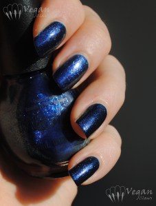
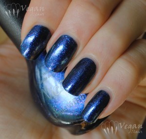
Nicole by OPI If the Blue Fits

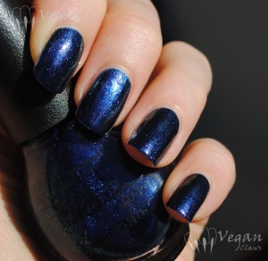
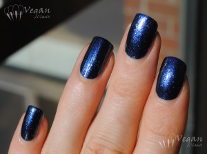
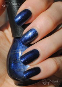
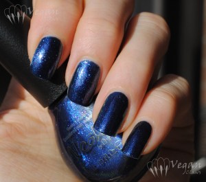
This glowy blue is one of the fall 2012 “Target exclusive” Nicole by OPI polishes that I bought from a blogsale.

Nicole by OPI If the Blue Fits

It’s a medium-deep blue with sparkly blue-purple-pink duochrome glass flecks that my photos don’t quite do justice to (but as always you can click on the photos to get a larger version).

Nicole by OPI If the Blue Fits

The formula is a little sheer but I imagine that’s what helps the duochrome flecks show up. I used three coats although two thick coats might be enough.

Nicole by OPI If the Blue Fits

In terms of application the formula was great, no issues.

Nicole by OPI If the Blue Fits

This is a really nice blue, and I love the finish!

Nicole by OPI If the Blue Fits

This last photo is an indoor shot with indirect light from my Ott Lite.

Nicole by OPI If the Blue Fits

China Glaze Want my Bawdy

Today I have another of the China Glaze New Bohemian polishes to show you. This is Want My Bawdy – groan-worthy name that looks like something OPI would come up with, but beautiful indigo blue shimmer with slight purple duochrome!

China Glaze Want My Bawdy

The duochrome on this one is very mild; it’s the least duochrome in the collection, but there is a bit of a purple flash at an angle in the right light, as seen in the above photo.

China Glaze Want My Bawdy

The formula was thin and sheer, and I got some bald spots in my application from not waiting long enough between coats (as often happens, I was rushing to get my swatching done before the sunset!). These swatches show three coats of the polish, no top coat.

China Glaze Want My Bawdy

In the next two photos I swatched it over black as I usually do with duochromes (one coat of Want My Bawdy over one coat of Kleancolor Black), but it didn’t really change the look of this one much. It mostly just makes it appear more blackened around the edges. This next photo is with flash (all the others are in sunlight).

China Glaze Want My Bawdy over black, with flash

Despite the very subtle nature of the duochrome in this polish, I’m personally not disappointed with it! It’s a beautiful glowy blue, and that hint of purple flash that comes out occasionally is just an added bonus. 🙂

China Glaze Want My Bawdy over black

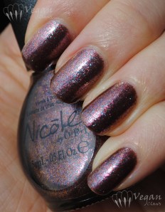
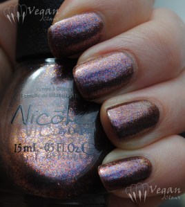
Nicole by OPI Just Busta Mauve

Nicole by OPI Just Busta Mauve

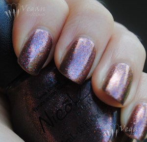
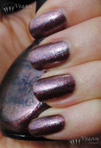
This amazing polish is Nicole by OPI Just Busta Mauve, which I haven’t seen for sale here in Canada (it’s supposed to be exclusive to Target stores and we don’t have those yet), but I was able to get with the help of someone having a blogsale! (Thanks again, Amy! :))

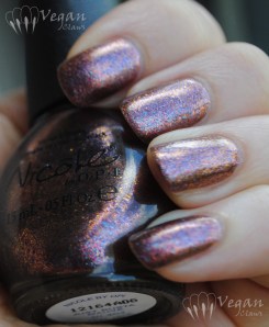
Nicole by OPI Just Busta Mauve

Shown are three coats plus a layer of topcoat; the polish is slightly sheer to allow the duochrome iridescent shimmer to show through.

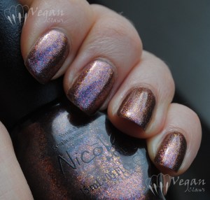
Nicole by OPI Just Busta Mauve

I recommend waiting a minute between coats to avoid any balder spots near the cuticle, but other than that the formula was good!

Nicole by OPI Just Busta Mauve

These photos are in natural light, various degrees of shade/partial sun.

Nicole by OPI Just Busta Mauve

I love the finish on this polish! As you can see, there are a whole lot of colours in the flecked/foily particles: mauve, blue, copper, pink, plum, and a lovely warm golden orange colour shift at an angle. It’s the kind of polish that doesn’t really belong to just one colour family!

Nicole by OPI Just Busta Mauve

There are two other polishes in this release that have a similar finish, and I’ll be posting those at a later date. 😀

Nicole by OPI Just Busta Mauve

China Glaze Fast Track

China Glaze Fast Track is a taupey-beige nude with heavy golden shimmer flakes. It was released last spring in the Hunger Games collection.

China Glaze Fast Track

Shown are two thick coats. In the sun photos, there’s also a layer of topcoat. As evidenced by the sideways watermark, these pics were also taken using my phone, haha!

China Glaze Fast Track

I found the formula a little thick but didn’t have any problems with application.

China Glaze Fast Track

The sun photos didn’t quite catch all the tiny sparks of different colours, little flashes of orange and green, that are often reflected in the sparkle of this awesome polish!

Here it is in the shade:

China Glaze Fast Track

China Glaze Fast Track

As a bonus here is what I ended up doing to this mani after a couple of days, mainly because I didn’t want to take the time to remove Fast Track first, and then I just kept adding things, haha…

China Glaze Fast Track with

Over Fast Track is a coat of Orly Nite Owl, an opaque taupe with silver shimmer, then two layers of Glitter Gal Buckled Bronze, Nubar Petunia glitter on the tips, and Spoiled by Wet n Wild’s Trust Fund Baby over it all!

China Glaze Fast Track with

Soulstice Monterey and comparisons

I’ve got another Soulstice polish to show you today; this one is an older shade that I purchased online from Nail Polish Canada.

Soulstice Monterey

Monterey is a medium dusty blue creme. In fact, on applying one coat, it looks like the base is sheer and milky, which gives the polish its soft, dusty look. I had a hard time capturing the true colour of this shade; in real life it seems a bit softer than some of these photos suggest.

Soulstice Monterey

Monterey covers pretty well in two coats, although the formula is slightly thin so if your nails have ridges like mine, it’s better at three coats, which is what I used for these photos. I didn’t have any base coat under this swatch, so a ridge filler probably would have helped too.

Monterey in the shade:

Soulstice Monterey

I have a comparison to some other blue polishes that are actually not very similar to Monterey at all! From left to right, Cult Nails Time Traveler, Monterey, Nails Inc Baker Street, and Sally Girl Epic which is like a lighter version of Baker Street. Monterey actually looks truer to colour in this photo.

Soulstice Monterey comparison

Left to right: Cult Nails Time Traveler, Soulstice Monterey, Nails Inc. Baker St, Sally Girl Epic

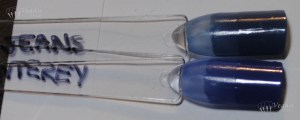
After doing that comparison, I realized that I actually *did* have a polish that was much closer to Monterey than the others, Nubar Boyfriend Jeans. This photo makes these polishes look darker than they are, but it shows the two relative to each other.

Soulstice Monterey comparison

Top to bottom: Nubar Boyfriend Jeans, Soulstice Monterey

Closer, but far from being a dupe; Boyfriend Jeans has a hint of teal in it in comparison.

I love Monterey; I love the milkiness and the way it builds up and the fact that it’s super glossy (no top coat in these photos). And as the comparisons show, it’s also a totally unique shade of blue in my polish stash!

Soulstice Santa Monica and Nevis

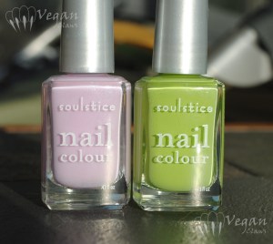
I’m very excited today to be able to show you two brand new polishes from Soulstice! Santa Monica and Nevis are two of four shades that have just been released. This half of the set isn’t your traditional fall colours, but they are gorgeous!

Soulstice Spa Santa Monica and Nevis

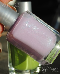
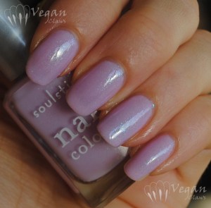
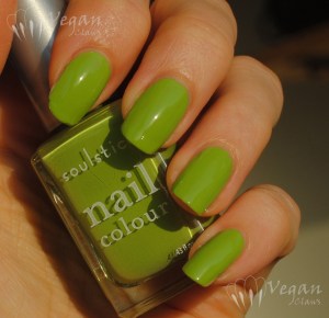
On the left we have Santa Monica, a light lavender with blue/pink duochrome glass flecks, and on the right, Nevis, a leafy green creme. The following photo shows the shimmer in Santa Monica that the previous one didn’t catch!

Soulstice Spa Santa Monica

Santa Monica is really, really pretty. It’s sheer at first, since it has a jellyish base to allow the shimmer to sparkle through. The formula was good, slightly thin but not runny. I used three coats here.

Soulstice Spa Santa Monica

Disclaimer: please note that I took these photos as the sun had just begun to set, so they appear a bit warmer than in real life! (Also, my index finger is still growing out the last of the break I had a while back, so any irregularities you might see there at the tip are not the fault of the polishes!)

Soulstice Spa Santa Monica

These next two photos at an angle show the colour shift in the shimmer better. As usual, you can click on any photo to enlarge it and get a better look at the details.

Soulstice Spa Santa Monica

Blue duochrome glass flecks, of course, mean instant love to me. 😉

Soulstice Spa Santa Monica

And here is what Santa Monica looks like in the shade:

Soulstice Spa Santa Monica

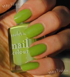
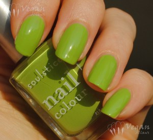
And now for Nevis! I definitely have a soft spot for this sort of green, bright and leafy and bold!

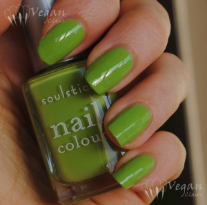
Soulstice Spa Nevis

I found the formula thin on this one, and the first coat went on streaky as a result. However, a second slightly thicker coat evened it all out!

Soulstice Spa Nevis

This shade of green looks like it’s close to Misa Good to Be Green, which I loved, and I love this! As a side note, just after I did my comparison post for Good to Be Green, I ended up with two other polishes that are a lot closer to it than the ones in my comparison photos! With this one, that makes three similar ones I have, so I’ll have to revisit that comparison in a new post!

Soulstice Spa Nevis

Here is Nevis in the shade:

Soulstice Spa Nevis

The other two shades in this release are Napa, a shimmery deep red, and St. Barts, a shimmery deep teal, that also look like they’re going to be great! I’m definitely looking forward to picking those up when Nail Polish Canada gets them in stock… For those of you in the US, the four new shades are already available from Soulstice’s web store!

Disclosure: The polishes in this post were provided to me by the company for my honest review. The opinions expressed are entirely my own.

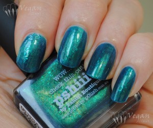
Picture Polish Pshiiit

I recently learned that Australian brand Picture Polish is vegan-friendly, so of course I had to buy some of their polishes to try them out!

Picture Polish Pshiiit

This beauty is a brand-new shade called Pshiiit, as it was a collaboration with French web-store owner and blogger Camille of Pshiiit. Picture Polish recently did several collaboration shades with e-tailers in their distribution network, and I’ll also have swatches of a couple of the others soon.

Picture Polish Pshiiit

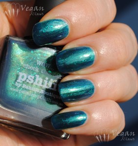
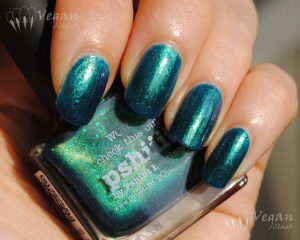
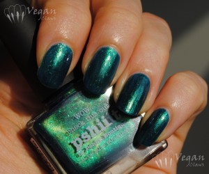
Pshiiit is a teal jelly with flakies and lots of fine gold shimmer as well as some microglitter thrown in. Gorgeous! I recommend clicking on the photos to see all the detail of the finish in the larger versions!

Picture Polish Pshiiit

I found the formula had a little of the thin-yet-thick thing going on, but didn’t have trouble with it and a second, thick coat evened everything out. This could easily be worn as a layer over a creme polish for those who don’t like visible nail lines.

In the shade:

Picture Polish Pshiiit

Love it! Great job, Camille and Picture Polish! 😀