A vegan nail polish blog. A celebration of colour and light, as well as of justice for nonhuman animals.

Archive for May, 2012

Barry M Peach Melba

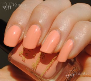
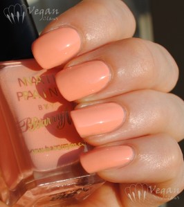
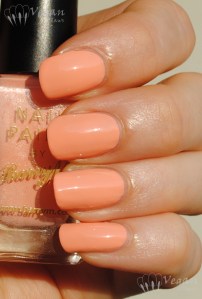
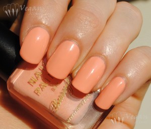
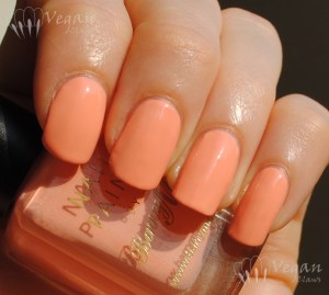
Today for your viewing pleasure, I’ve got more photos than necessary of a plain peach creme! Heh. I like the photos and don’t feel like choosing. This is Barry M Peach Melba, a very nice creme peach shade.

Barry M Peach Melba

Shown are three coats, and my index has a layer of Poshe topcoat overtop to cover up a big smudge that I got from removing a cat hair that got into the wet polish before I could take the pictures!

Barry M Peach Melba

It’s a pastel shade of coral-toned peach, not too pale and not too bright. Disclaimer: these photos were taken in sunlight as the sun was beginning to set, so they are more orange-toned than in other lighting situations.

Barry M Peach Melba

I found the formula a little thick and hard to level, hence the need for three coats. I added a few drops of thinner to the polish. All that may have had something to do with the hot and humid weather. (I suspect this might be a frequent theme in my posts for the next few months… “It was thick and I had to add thinner, but…”)

Barry M Peach Melba

I found that it dried very quickly, but again the weather might have been a factor…

Barry M Peach Melba

I really like peaches and corals lately; I’ll have to do some more comparison posts for these shades! Especially since these ones turned out a little too orange!

Barry M Peach Melba

White Creme Comparison

Today I’ve got a comparison to show you of the plain white creme polishes that I own. As you’ll see, one of the four is the clear winner in terms of opacity and formula!

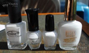
White creme comparison

From left to right, we have: Color Club French Tip, Kleancolor White, Sally Girl Pure, and Milani White on the Spot. This is the order in which I acquired these polishes, and getting the Milani from their fast-dry line with its supposed “one coat formula” is what prompted the comparison. I was skeptical and figured that was total BS since white cremes are notoriously streaky and badly-behaved, but as it turns out, the Milani white is actually *almost* a one-coater so the claim is only a slight exaggeration!

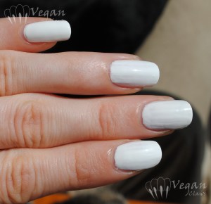
This first photo shows one coat of each polish, index to pinkie (bottom to top) in the same order as the bottles. I applied them all with a fairly thick coat (basically just not wiping off the brush on the bottle rim before applying), since whites and pastels usually benefit from a light touch rather than applying a lot of very thin coats which tend to go on streakier.

White creme comparison - 1 coat

As you can see, the Milani on the pinkie is actually not bad, some bald areas but not too streaky looking! The other three polishes were very similar to one another (in terms of how the photo looks, the Sally Girl on my ring finger has an unfair disadvantage here, since that nail has the most ridges and for some reason has more of an orange stain than the others!). They were streakier and less self-leveling than the Milani. My mini bottle of Kleancolor needed a few drops of thinner in it, but that was no doubt just due to the fact that it’s the one I’ve actually used the most. I actually prefer the Kleancolor’s thick consistency among those three other polishes.

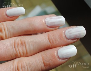
Here they are at two coats (without top coat). You can see that the Milani on my pinkie is the most opaque and smoothest; the others are slightly ridged lengthwise since they don’t self-level as well as the Milani. In terms of drying time, I didn’t really notice the Milani being much quicker than the others or anything, but they all dried fairly quickly.

White creme comparison - 2 coats

Next I wanted to compare them in terms of how well they do for stamping. As a base I used one coat of Kleancolor Plum (followed by some quick dry top coat), then I used a design from Konad plate M15 and stamped on each polish in the same order as before (here, left to right). Please disregard the smudged/missing and crooked parts (augh, that pinkie!); that’s just user error and not the polishes!! They all worked pretty similarly but the Milani and the Color Club gave a slightly brighter white image.

White creme comparison - stamping

Next I stamped using the French tip designs from Konad M86. (Polishes are in the same order index to pinkie, so now, right to left.) As you can see they don’t work so well for these larger-area images, though the actual gaps in the design are more user error than anything else. None of them leaves a very opaque image though; the stamps all have a sort of rippled look to them. Not sure if that could be reduced a bit by using a lighter touch when transferring the image onto the stamper. Again the Milani and Color Club give a slightly brighter result.

White creme comparison - stamping

After stamping on the French tips I carefully went over them again with polish, just brushing it on, to fill them in and attempt to make them somewhat presentable. Here’s the result; all of them worked fine for this but the Milani did give the smoothest result. In terms of brushes, I should mention that the Fast Dry Milanis have a flat wide brush, similar to OPI and Kleancolor brushes. (Even the Kleancolor minis have a flat brush, though on a smaller scale. The other two polishes here have skinny round brushes.)

White creme comparison - french tips

Another photo featuring Wade in the background!

So there you have it; best white creme polish in my (albeit limited) experience is definitely Milani’s White on the Spot!

China Glaze Magnetix: Cling On and You Move Me

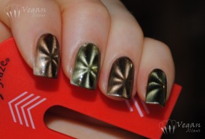
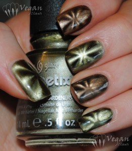
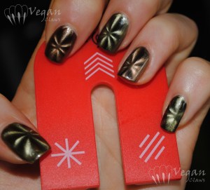
I picked up two of the China Glaze Magnetix polishes a couple of months ago, Cling On and You Move Me (green and brown respectively), along with the China Glaze magnet. Here is the alternating mani I did with these two polishes. Photos are all indoor with flash; it was very overcast when I took them and the non-flash photos I took didn’t show the magnetic designs very well at all.

China Glaze Cling On (green) and You Move Me (brown) with magnet

I used two coats of each polish, one as a base layer and then used the star magnet over the second coat. I added top coat before taking the photos. I’ve heard that many people don’t like the China Glaze magnet; personally I thought it was fine and didn’t really have much trouble using it, but then again it’s the first magnet I’ve used aside from this one strong fridge magnet I have! As you can see I did have a bit of trouble with centering the design, especially on the pinkie, though. I haven’t tried the other two designs on the China Glaze magnet, just the star.

China Glaze Cling On (green) and You Move Me (brown)

I didn’t really like these polishes as much as I thought I would, especially the green. It seems weird to say since the magnetic design does give an illusion of depth and texture, but the colour on that one just feels flat to me. Maybe if it had a bit of golden shimmer in there somewhere… Maybe I need to try it by itself and with the other magnet designs. The brown one, You Move Me, I do kind of like. More recently I got one of the Color Club magnetics, the coppery one, and I have a feeling I’ll like that one better; it looks like the shimmer has a lot more depth to it!

China Glaze Cling On (green) and You Move Me (brown) with magnet

OPI The Show Must Go On

Today’s post will be short on words but heavy on pictures. This is another example of my favourite type of polish – duochrome glass fleck!

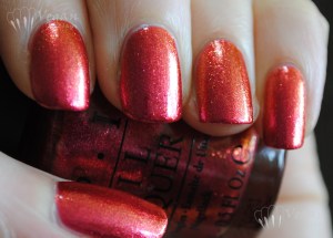
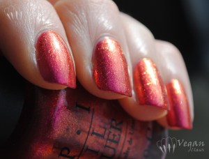
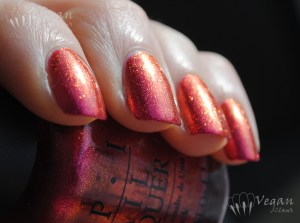
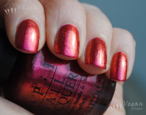
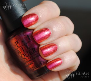
OPI The Show Must Go On is from their Burlesque collection which was a holiday 2010 collection. It’s red but shifts colours from fuchsia through to orange, copper and even some golden yellow at extreme angles. I love it! It has a great formula too. Shown are three coats, but the third one I just put on before photographing because I’d had the polish on a while and somehow got some hairline cracks, not chips, in it while doing dishes! Two coats is enough for opacity. Shown in various lighting situations as listed.

Ott Light:

OPI The Show Must Go On

OPI The Show Must Go On

Sun:

OPI The Show Must Go On

OPI The Show Must Go On

Natural light, various degrees of overcast/partly sunny:

OPI The Show Must Go On

OPI The Show Must Go On

OPI The Show Must Go On

OPI The Show Must Go On

OPI The Show Must Go On

OPI The Show Must Go On

OPI The Show Must Go On

OPI The Show Must Go On

OPI The Show Must Go On

Soulstice Spa Harbour Island and Cape Cod

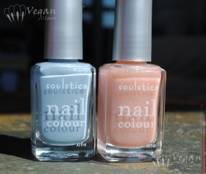
Soulstice Spa has released four new polish shades into their collection for spring 2012, and today I have two of them to show you, complete with comparisons to a couple other polishes I have.

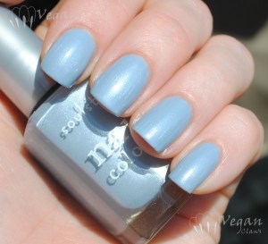
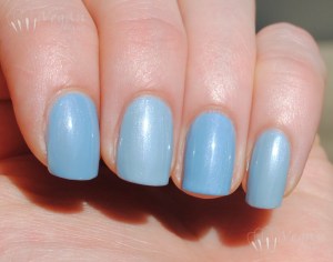
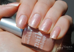
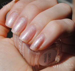
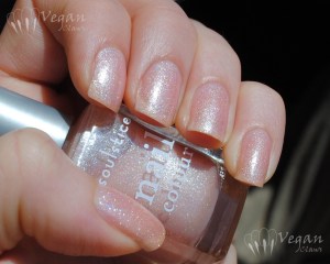
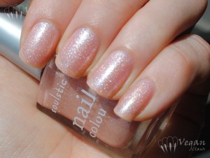
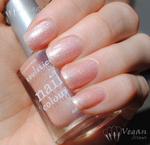
The two polishes I got are Cape Cod, a light, slightly muted blue with pearly shimmer, and Harbour Island, a pale, sheer peachy-pink-nude jelly with holographic glitter in it! As a bonus, a couple of adorable kitties will be making an appearance in today’s photos! 😉 All photos are taken in direct sunlight.

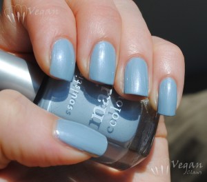
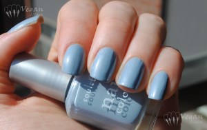
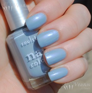
These next photos are three coats of Cape Cod. At first I found the formula to be thick so I was having trouble evening out my coats but I added a little Beauty Secrets thinner and that helped a lot.

I really like this shade of blue and the fine pearly shimmer!

The shimmer has a sort of blueish glow to it in the sunlight, very cool!

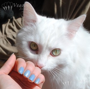
This polish reminded me of Milani Antique, another light blue with the same type of finish, so I did a little comparison. Index and ring are Antique, middle and pinkie are Cape Cod, three coats each. As you can see the Milani is a couple shades darker than Cape Cod.

And here is my boy Thor checking out the comparison, haha!

Next up, Harbour Island. These photos are also three coats.

The formula was really smooth and easy to apply but it’s a sheer and the third coat adds more sparkle and reflectivity.

The base colour of this polish is pale peach with a bit of a pinkish tone.

The holo glitter does dry slightly rough, but top coat easily takes care of that (these photos include top coat).

As always you can click on any of these photos to see the sparkly holo glitter in better detail!

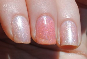
I can’t say that I have any other peach/nude jellies with holo glitter! But here is a comparison to the closest thing I have, LA Splash Sparkling Jellyfish. Sparkling Jellyfish, in the middle in the following photo, is significantly deeper, brighter and more pink.

And finally, Harbour Island makes a great layering polish; here it is over China Glaze V, a light orange-coral creme. Hanging out in the photo is my boy Wade! (Wade lost an eye to a severe upper respiratory infection as a kitten when he first arrived at the shelter, but it doesn’t slow him down in the slightest! Nor does it prevent him from being the alpha male in our little feline “colony”!)

The other two polishes in this release, which I don’t have (yet, at least!), are St. Tropez, a beige nude that looks to have pearly shimmer similar to Cape Cod, and Kauai, a berry pink with golden shimmer. If you’re curious about them, blogger Glazed Talons reviewed them both here. These shades are available directly through Soulstice Spa on their website; Nail Polish Canada also sells Soulstice but they don’t have these new shades in stock yet as of the time I’m posting this.

Disclosure: the Soulstice Spa polishes in this post were provided to me for review. All opinions are my own honest opinions. (The other polishes in this post were purchased by me. The cats were rescued from the street and adopted from a shelter, respectively. :P)

Pastel Skittles Mani

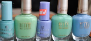
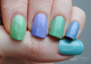
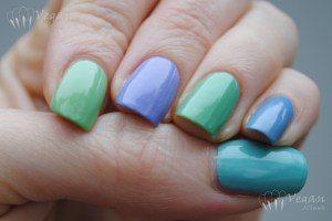
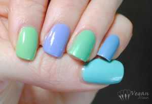
Just a quick post today to share a recent pastel skittles (each nail a different colour, for those who aren’t familiar with nail-polish-addict-speak ;)) manicure I did. I felt like doing something spring-like and cool-toned, and here are the polishes I decided on: Essence You Belong To Me, Milani Original, Essence A Lovely Secret, Milani Dressmaker, and Milani Antique.

Essence You Belong To Me, Milani Original, Essence A Lovely Secret, Milani Dressmaker, Milani Antique

Essence You Belong To Me is a pastel turquoise creme with some fine pearly secret shimmer; Milani Original is a mint green creme; Essence A Lovely Secret is a lavender creme with fine warmer-toned and slightly darker magenta-purple glitter; Milani Dressmaker is a pale minty jade with turquoise shimmer; Milani Antique is a slightly muted/dusty light blue creme with fine pearly secret shimmer. Three coats of each polish (actually I think I added a fourth of Dressmaker, since it’s a pretty sheer polish).

Unfortunately there was no sun when I wore this, so the shimmer of the polishes doesn’t show up very well in the photos, although if you click to enlarge them you can see some, especially in the first photo. These pics include topcoat; I had been wearing the mani a while when I took them. Overcast natural light:

Essence You Belong To Me, Milani Original, Essence A Lovely Secret, Milani Dressmaker, Milani Antique

Essence You Belong To Me, Milani Original, Essence A Lovely Secret, Milani Dressmaker, Milani Antique

Artificial light (Ott light) – the colours are truer in this photo, as the previous ones make them seem a little darker than they are:

Essence You Belong To Me, Milani Original, Essence A Lovely Secret, Milani Dressmaker, Milani Antique

Color Club holos and Konad plate M86

I was recently asked by Nail Polish Canada if I’d like to review one of the new Konad stamping plates they’ve added to their selection of image plates. The three new ones, M86, M87, and M88 are all French tip designs of various types.
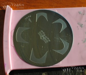
Konad plate M86

This is the plate I received, M86, plain French tips with a pronounced inner curve, and an across-the-nail band that resembles a frilly lace garter.
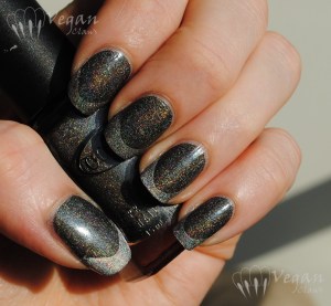
I decided to use two Color Club holographic polishes, Revvvolution and Worth the Risqué, since these are very pigmented one-coat polishes, and so, good for stamping.

As you can see in the pics, my metal scraper already left some scratches on the surface of the plate, but this is normal when using a metal scraper and it doesn’t affect the results at all.
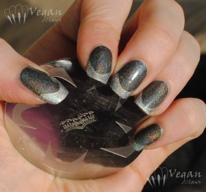
If you’ve never used French tip Konad designs before, I will say that there is a learning curve to it. I had never used Konad French tips and I had to practise at least a half-dozen times before I got something that I felt was decent enough to photograph. What helped me a lot in the end was watching this French mani tutorial by blogger The Polished Mommy. She goes through two different methods for French tips, one of them being Konad, and part-way through the tutorial when she demonstrates rolling the stamper onto the nail tip starting at one side, I had an “aha” moment, as I’d previously been trying to stamp head-on and the tips would almost always turn out crooked. I’d definitely recommend watching it if you’re like me and trying this type of stamping design for the first time!
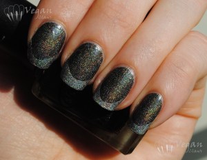
The base polish is two coats of Revvvolution, by the way (the second one wasn’t all that necessary but I added it just in case, since I was photographing it), and there is no top coat on these first photos.
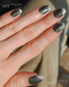
Another thing I learned in practising was to choose the right size of design for each nail. The plate has five tip sizes, and although it seems kind of silly to me now, at first I tried to use all five of them largest to smallest from thumb to pinkie. I ended up realizing that was a mistake, and to choose the correct design for each nail based on which one’s width seemed to best match the width of the nail.
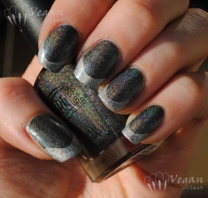
I ended up using the second-largest tip on my thumb, the second-smallest on my index, middle and ring fingers, and then the smallest on my pinkie. I was actually kind of relieved that I wasn’t using the largest one in the end, since the greater width of that one makes it a bit trickier to avoid scraping right down to the plate in the center of the design and ending up with a bald spot and having to start over. Not sure if this would be less of an issue when using an old credit card to scrape, like many people do, instead of the metal Konad scraper. The four smaller nail tips didn’t give me any trouble like that, though!

I then decided to add the lace-garter design across my nails, but of course the first one I did went on kind of crooked and with bald spots (some day I’ll get better at stamping, I swear! haha); I then applied the others haphazardly on purpose so that at least they’d all be similar! I still like the way it turned out. I also added topcoat before taking the rest of these photos.
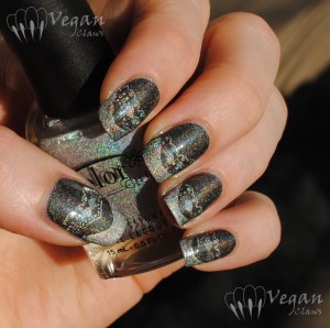
I was really happy that Worth the Risqué works so well for stamping. These two holos are gorgeous in the sunlight!
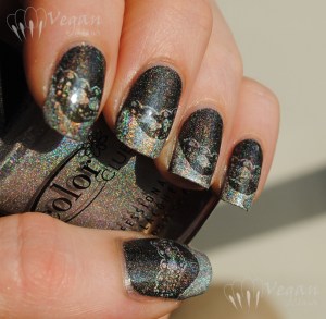
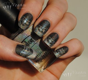
Although at first I was getting a little frustrated when I couldn’t get the tips stamped on straight, once I watched the tutorial and practised a little more it became a lot of fun to play around with this plate! Previously I’d only ever used French tip guide stickers (well, and tried freehand once, but that didn’t turn out well enough for me to be satisfied with it) but the thing with those is that you have to make sure that the base is completely dry before applying the stickers or else removing them will remove some of the base too. So, I’m really glad to have this plate; I’ll surely be doing French tips on my manis a lot more often now!!
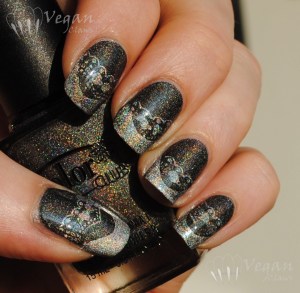
If you’re in Canada like me you can find this plate and others here at Nail Polish Canada. (edit: I just noticed on their site that they also ship to the US.) You can probably also find them wherever you normally get your Konad plates; I’m not sure how widely available the newly released ones are at this point. 🙂

Disclosure: the stamping plate in this post was provided to me for review. Opinions expressed are my honest opinions.

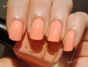
May Day!

Kleancolor Black with red stars that I picked out of Kleancolor Blind Date, in honour of International Workers’ Day.
Kleancolor Black with red stars picked out of Kleancolor Blind Date