A vegan nail polish blog. A celebration of colour and light, as well as of justice for nonhuman animals.

Posts tagged ‘creme’

Soulstice Santa Monica and Nevis

I’m very excited today to be able to show you two brand new polishes from Soulstice! Santa Monica and Nevis are two of four shades that have just been released. This half of the set isn’t your traditional fall colours, but they are gorgeous!

Soulstice Spa Santa Monica and Nevis

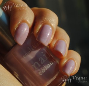
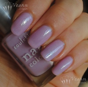
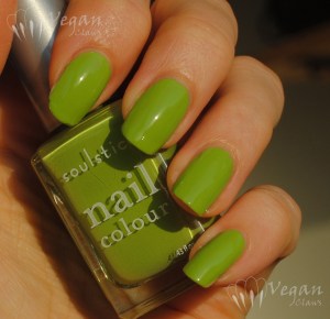
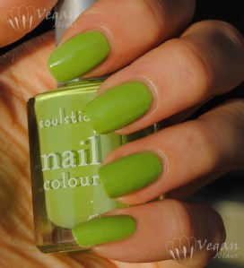
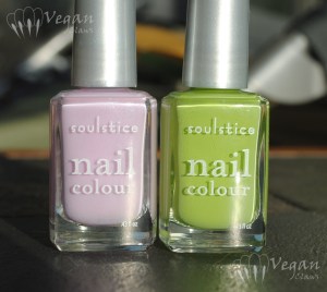
On the left we have Santa Monica, a light lavender with blue/pink duochrome glass flecks, and on the right, Nevis, a leafy green creme. The following photo shows the shimmer in Santa Monica that the previous one didn’t catch!

Soulstice Spa Santa Monica

Santa Monica is really, really pretty. It’s sheer at first, since it has a jellyish base to allow the shimmer to sparkle through. The formula was good, slightly thin but not runny. I used three coats here.

Soulstice Spa Santa Monica

Disclaimer: please note that I took these photos as the sun had just begun to set, so they appear a bit warmer than in real life! (Also, my index finger is still growing out the last of the break I had a while back, so any irregularities you might see there at the tip are not the fault of the polishes!)

Soulstice Spa Santa Monica

These next two photos at an angle show the colour shift in the shimmer better. As usual, you can click on any photo to enlarge it and get a better look at the details.

Soulstice Spa Santa Monica

Blue duochrome glass flecks, of course, mean instant love to me. πŸ˜‰

Soulstice Spa Santa Monica

And here is what Santa Monica looks like in the shade:

Soulstice Spa Santa Monica

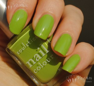
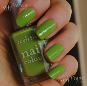
And now for Nevis! I definitely have a soft spot for this sort of green, bright and leafy and bold!

Soulstice Spa Nevis

I found the formula thin on this one, and the first coat went on streaky as a result. However, a second slightly thicker coat evened it all out!

Soulstice Spa Nevis

This shade of green looks like it’s close to Misa Good to Be Green, which I loved, and I love this! As a side note, just after I did my comparison post for Good to Be Green, I ended up with two other polishes that are a lot closer to it than the ones in my comparison photos! With this one, that makes three similar ones I have, so I’ll have to revisit that comparison in a new post!

Soulstice Spa Nevis

Here is Nevis in the shade:

Soulstice Spa Nevis

The other two shades in this release are Napa, a shimmery deep red, and St. Barts, a shimmery deep teal, that also look like they’re going to be great! I’m definitely looking forward to picking those up when Nail Polish Canada gets them in stock… For those of you in the US, the four new shades are already available from Soulstice’s web store!

Disclosure: The polishes in this post were provided to me by the company for my honest review. The opinions expressed are entirely my own.

Beauty Without Cruelty polishes

Beauty Without Cruelty was one of the first brands to produce entirely vegan cosmetics and today I have swatches of my Beauty Without Cruelty polishes to show you. I only have four of them, and it just so happens that three of them are pink. For each of them, I have two photos in the sun followed by one in the shade. I didn’t use any topcoat for these photos.

Beauty Without Cruelty Sweet Pea

Sweet Pea is a light/medium pink creme, not bright but not too dusty. The formula was thin and a bit runny; this is two coats (three on my index because I messed it up).

Beauty Without Cruelty Sweet Pea

Beauty Without Cruelty Sweet Pea

Next, Pink Crush. This is a bright fuchsia squishy-looking semi-jelly polish. The formula was not as runny as Sweet Pea, and this was two coats.

Beauty Without Cruelty Pink Crush

Beauty Without Cruelty Pink Crush

Beauty Without Cruelty Pink Crush

Rich Plum is a rich shimmery purple. This one made me realize that these polishes don’t have mixing balls, as the shimmer was uneven in my bottle and I had to shake it quite a bit to get it distributed. Shown are two coats; this one can show very slightly visible brushstrokes and I recommend waiting a few minutes between coats to prevent dragging.

Beauty Without Cruelty Rich Plum

Beauty Without Cruelty Rich Plum

Beauty Without Cruelty Rich Plum
The last one I have is Geranium, a magenta-pink creme. The formula was thin but not runny, and this is two coats.

Beauty Without Cruelty Geranium

Beauty Without Cruelty Geranium

Beauty Without Cruelty Geranium

These polishes have a flat brush that is less wide than the OPI pro-wide brush. The BWC nail polish line is pretty basic; there are only about 15 colours, but the polishes, brushes and bottles are pretty nice overall! I have two more of the shades on the way to me that I purchased from a blog sale, so I should have a couple more swatches to show once they arrive!

Misa Epiphany, Taking Chances, and a comparison

Today I have my two picks from Misa’s Wanderlust collection for fall 2012 to show you.

First is Misa Epiphany, a light beigey mustard shade with gold shimmer. The finish is kind of like a creme with shimmer flecks in it. I used two thick coats; I found the formula to be thick but not a problem to work with if you use thick coats and don’t manipulate it too much.

Misa Epiphany

I love this shade! It makes me think of a shimmery version of China Glaze’s Kalahari Kiss. The large version of this next photo gives a good view of the finish.

Misa Epiphany

The second polish I got from this collection is Taking Chances, which has the same finish as Epiphany but in a coppery, dusty light orange with gold shimmer. Very appropriate for fall!

Misa Taking Chances

Formula was also similar to Epiphany, maybe a bit less thick. This was also two thick coats.

Misa Taking Chances

I really like this shade as well, but when I opened the package, I thought, “this looks familiar!”

Misa Taking Chances and Sephora by OPI It's all About the Fringe

Here is Taking Chances next to Sephora by OPI’s That’s What Fringe is For, from their spring 2012 collection.

Misa Taking Chances and Sephora by OPI It's all About the Fringe (Misa, SOPI, Misa, SOPI)

Left to right: Misa, SOPI, Misa, SOPI

They aren’t *exact* dupes, but, well, for all intents and purposes they are dupes. It’s really hard to see the differences, so I’m including several photos of the comparison. From index to ring are the Misa, SOPI, Misa, SOPI, two coats of each.

Misa Taking Chances and Sephora by OPI It's all About the Fringe (Misa, SOPI, Misa, SOPI)

Left to right: Misa, SOPI, Misa, SOPI

The biggest difference is in the formula, since the OPI is much thinner (not runny though). It also seems that the Misa has slightly bigger shimmer particles, making it appear a tiny bit lighter at times with the added reflectivity. Just barely.

Misa Taking Chances and Sephora by OPI It's all About the Fringe (Misa, SOPI, Misa, SOPI)

Left to right: Misa, SOPI, Misa, SOPI

Great colour, but if you have one of these two you probably don’t need the other! Unless you have the mini bottle of the Sephora version, like I do, and want the Misa as a backup!

Zoya Shelby and Comparisons

When I posted my Zoya Beach skittles, I promised swatches and comparisons of the Beach and Surf collection polishes, and the project is going slowly but I’ve finally got the first one ready: Zoya Shelby, a bubblegum pink creme.

Zoya Shelby

I used three coats for this swatch because I was having issues with streaks and lumps, but I think I had just had too much coffee that day or something since I only needed two coats of Shelby when I did the skittles.

In shade:

Zoya Shelby

These next two photos were taken the following day so they include top coat. I can’t remember what happened to my index finger to make it no longer presentable, I suppose probably a chip! As usual, the ridges on my ring finger are just the way the nail is, not the fault of the polish!

Zoya Shelby

Zoya Shelby

Now for some comparisons. Each swatch on the nail wheel progressively shows the polish at one, two and three coats from base to tip. These were taken in full sunlight which is probably not the best light for photographing nail wheels (diffused light would be better), so I’m including two photos at different angles.

Zoya Shelby comparisons

Left to right: China Glaze Pink Underground, Wet n Wild Candylicious, Milani Tip Toe, Zoya Shelby, Gosh Bubblegum, Nubar Pink Creme, OPI Got a Date To-Knight, China Glaze Empowerment, OPI Pink Friday

I included one shimmer polish (Pink Underground) since the shimmer is subtle and the base colour is in the same family. I also included some popular darker (Candylicious) and lighter (Got a Date, Pink Friday, Empowerment) pinks to show where Shelby fits into the spectrum.

Zoya Shelby comparisons

Left to right: China Glaze Pink Underground, Wet n Wild Candylicious, Milani Tip Toe, Zoya Shelby, Gosh Bubblegum, Nubar Pink Creme, OPI Got a Date To-Knight, China Glaze Empowerment, OPI Pink Friday

These last swatches are under the Ott Lite, showing just the polishes that are closest to Shelby.

Nubar Pink Creme, Zoya Shelby, Gosh Bubblegum, Milani Tip Toe Pink

Top to bottom: Nubar Pink Creme, Zoya Shelby, Gosh Bubblegum, Milani Tip Toe Pink

I’d say in one way that Gosh Bubblegum is the most similar of them since it also has a cool undertone while Tip Toe Pink and Pink Creme are slightly more warm. But Tip Toe Pink is the closest in terms of the depth of the shade, since the Gosh polish is definitely lighter!

Illamasqua Whack with Nubar Orange Glitter and Fingerpaints Twisted

Some quick pics of a manicure I did last week! This is Illamasqua Whack, a red-toned orange creme with a really nice formula. It’s almost a one-coater; I ended up doing two coats here. I dabbed on Nubar Orange Glitter at the tips and then a layer of Fingerpaints Twisted over everything!

Illamasqua Whack with Nubar Orange Glitter and Fingerpaints Twisted

Illamasqua Whack with Nubar Orange Glitter and Fingerpaints Twisted

Illamasqua Whack with Nubar Orange Glitter and Fingerpaints Twisted

Nubar Beguiling Carmine and China Glaze Sacred Heart

Like my previous post, these are some photos from a few months ago while I had my nails filed into claws.

First up is Nubar Beguiling Carmine (not made from actual beetle-derived carmine, of course!). I love this red! It’s a deep, brown-based red, not bright but not too dark.

Nubar Beguiling Carmine

Shown are two coats plus topcoat. There’s a little bit of cuticle drag so I probably should have added a third coat or waited longer in between coats.

Nubar Beguiling Carmine

Other than that no issues with the formula, it was quite smooth.

Nubar Beguiling Carmine

Beguiling Carmine is from the Polished Chic collection.

Nubar Beguiling Carmine

Next I’ve got China Glaze Sacred Heart, from the Ink collection. This is supposedly a neon, but it really doesn’t seem neon to me. The colour isn’t neon-bright, nor does it dry matte like most polishes with neon pigments do (no topcoat on this swatch).

China Glaze Sacred Heart

But it is a nice jellyish candy-apple red that leans warm. Shown are three coats; no application issues with this polish.

China Glaze Sacred Heart

In the bottle, Sacred Heart seems less bright and more brick-like than it does on the nail.

China Glaze Sacred Heart

And here is a photo of both of these polishes together, showing the contrast between the depth of the two shades! …trying to remember now… I think I had the camera sitting on the table and took this photo with my chin! πŸ˜€

China Glaze Sacred Heart and Nubar Beguiling Carmine

Glitter Gal Buckled Bronze

I’ve got a gorgeous duochrome from Glitter Gal to show you today! This is one of six new duochromes they recently released, and the lovely Kerry from Glitter Gal gave me the opportunity to review it (thanks, Kerry!). This one is called Buckled Bronze and it’s got a great plum-burgundy-bronze-copper colour shift!

Here it is with the box it comes in. I really like these new Glitter Gal bottles, square and solid and stylish looking – they’ve really done a nice job on their new packaging.

Glitter Gal Buckled Bronze

These photos are of one generous coat of Buckled Bronze over one coat of Kleancolor Black; these are sheer duochromes that show their full effect over black (or another very dark colour).

Glitter Gal Buckled Bronze

No topcoat here; it dries quite glossy on its own. The formula was thin and smooth, perfect for this sort of layering polish.

Glitter Gal Buckled Bronze

As always you can click on any of these photos to get a better view.

Glitter Gal Buckled Bronze

Glitter Gal Buckled Bronze

These next two photos are with flash in addition to sunlight. Head-on, the flash shows just howΒ nearly purple this polish appears in some lights!

Glitter Gal Buckled Bronze

And at more of an angle, the bronze tone becomes prominent:

Glitter Gal Buckled Bronze

At extreme angles, the polish even shifts to gold and green. If you click on the full size version of this next photo, you can see all the little multicoloured sparkles along with the gold-green shift – love it!

Glitter Gal Buckled Bronze

These next few photos are in indoor light.

Indirect natural light, sorry for the weird lumpy-looking reflections:

Glitter Gal Buckled Bronze

Under my Ott Lite:

Glitter Gal Buckled Bronze

Ott Lite plus flash:

Glitter Gal Buckled Bronze

Glitter Gal Buckled Bronze

And here is what the polish looks like on its own – as you can see it’s definitely sheer! Left to right, one, two, three, and four coats of Buckled Bronze. The pinkie with four coats shows how the base of the polish is kind of a smokey taupe colour.

Glitter Gal Buckled Bronze

Anyway, as you may have guessed by now, this is a great polish and I love it! The colour scheme is right up my alley. This and the other five new Glitter Gal duochromes, shown in the following company promo image, are available here on their website, or from one of their international distributors listed here.

Disclosure: This polish was provided to me by the company for my honest review. The opinions expressed here are entirely my own.

China Glaze Kalahari Kiss and I Herd That

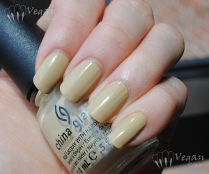
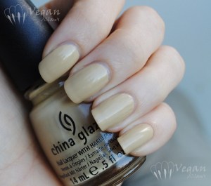
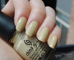
Here are the other two On Safari polishes that I recently purchased. First up is Kalahari Kiss, a very yellow-toned beige creme (I love this colour!). Shown are two coats and I had no issues with the formula; it went on quite smoothly. Photos are in partially sunny and shady conditions.

China Glaze Kalahari Kiss

China Glaze Kalahari Kiss

China Glaze Kalahari Kiss

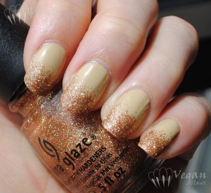
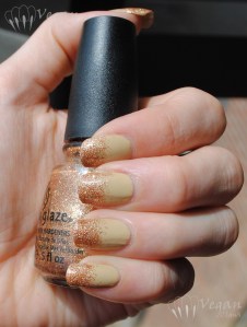
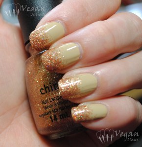
I did a glitter-tipped gradient using I Herd That over Kalahari Kiss. I Herd That is an orange-toned bronzy glitter with holo glitter in it. It was quite easy to apply, I just brushed and dabbed it on to make the gradient. I did two coats of the glitter at the tips, receding to one coat further back on the nail, then added top coat. The glitter dries a bit rough (and matte) so a layer or two of topcoat is needed if you want to smooth out the texture and get it nice and shiny.

China Glaze Kalahari Kiss and I Herd That

China Glaze Kalahari Kiss and I Herd That

Under my Ott Lite:

China Glaze Kalahari Kiss and I Herd That

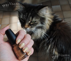
This next photo features my beautiful girl Azrael!

China Glaze Kalahari Kiss and I Herd That with Azrael

Next I have two coats of I Herd That over bare nails (plus one coat of Poshe topcoat) to show how it looks on its own. As before, it was easy to apply, no need to “place” the glitter or anything like that.

China Glaze I Herd That

Since a few people had expressed curiosity about how this one compares to last winter’s Ulta-exclusive China Glaze glitter polish, Fireside Glow, I decided to do a comparison. I compared it to Fireside Glow and Ulta-mate Holiday, the other Ulta-exclusive glitter in that same release, both of which I was able to obtain thanks to a helpful US-based nail polish enthusiast! πŸ™‚

Left to right, Fireside Glow, I Herd That, Ulta-mate Holiday:

The swatches show two coats of each polish. I found the formula thinner on the Ulta exclusive shades; they were not quite as easy as I Herd That to get opaque in two coats without getting bald spots, but no big issues. Index to pinkie, Fireside Glow, I Herd That, Ulta-mate Holiday, I Herd That.

As you can see, Fireside Glow is not all that close to I Herd That after all; it’s much more of a pinkish copper shade. Ulta-mate Holiday is obviously much more yellow than the others and seems to have a higher concentration of holo glitter whereas the others also have copper and orange glitters mixed in respectively. I Herd That seems to have a little less holo glitter than Fireside Glow.

On the other hand I found I Herd That to be sparklier than the others in lower lighting situations, probably because of the greater amount of non-holo glitter, if I had to guess why!

Slightly blurred to show the holo sparkle in the sun:

Misa Good to be Green and Comparisons

Good To Be Green is a new apple-green creme polish from Misa’s Hot Summer collection. Since I love this colour, I couldn’t pass it up, although I was sure I already owned a dupe. Turns out I was wrong!

Misa Good to be Green

I found the formula a little thin when I tried it; this is two coats, the second somewhat thick. I actually had some pooling due to the thinness of the polish, which is rare for me these days, but in the end it turned out fine, nice and opaque.

Misa Good to be Green

I thought this one would be the same as Orly Green Apple, but it turns out not to be. The Orly is on my index, the Misa on my middle finger. As you can see, the Misa is a deeper green; the Orly is several shades lighter. I also applied the Orly in two coats, the second being thick.

Orly Green Apple, Misa Good to be Green, OPI Who the Shrek are You, Zoya Mitzi

I included a couple of other polishes in the comparison to show that they’re basically in a different shade family – OPI Who the Shrek Are You? on my ring finger, and Zoya Mitzi on my pinkie, both much more yellow than Good to Be Green.

Orly Green Apple, Misa Good to be Green, OPI Who the Shrek are You, Zoya Mitzi

Who the Shrek Are You? was also a bit thin (everything seemed to be applying thin that day, and yet it was very hot and humid; I thought I might be in the Twilight Zone…) and I used three coats since it was on my ridgey ring finger.

Orly Green Apple, Misa Good to be Green, OPI Who the Shrek are You, Zoya Mitzi

A shade or two lighter than Who the Shrek Are You?, Zoya Mitzi is a very yellow-based neon lime matte polish; here I added topcoat to it for the sake of the comparison with the other glossy cremes. Mitzi was streaky to apply and prone to dragging, so I used three coats to cover some bald spots and streaks.

This is another comparison that would make a nice ombre mani! I love the progression of these bright green shades.

China Glaze Desert Sun and Comparisons

Desert Sun is one of three shades I picked up from China Glaze’s new On Safari collection. I’ve got another post in the works featuring the other two polishes but I’ll start with this one!

China Glaze Desert Sun

This is one of those “ugly-pretty” shades I love so much. It’s a medium orangey-brown creme. It actually turned out to be a bit more orange than I expected.

China Glaze Desert Sun

I found the formula a little thin, but no big application issues. This is two coats. In the background of this next photo is Azrael; she’s standing on top of a covered litterbox that’s next to the solarium window where I take my pics…

China Glaze Desert Sun

I compared this shade to some similar ones I have. From index to pinkie, we have OPI Ginger Bells, China Glaze Desert Sun, OPI & Apple Pie, and Joe Fresh Pumpkin. Each swatch is two coats of polish, no top coat.

OPI Ginger Bells, China Glaze Desert Sun, OPI & Apple Pie, Joe Fresh Pumpkin

Desert Sun is very similar to OPI & Apple Pie, but Apple Pie is slightly more brown. I found the formula to be better on Desert Sun, as OPI & Apple Pie was thinner & seemed more prone to bald spots. Apple Pie is also an older OPI from before they went “big 3 free” so it has DBP, toluene, etc in it as well as the old skinny brush.

OPI Ginger Bells, China Glaze Desert Sun, OPI & Apple Pie, Joe Fresh Pumpkin

As you can see Ginger Bells is darker and has more of a red tone than the others, and Pumpkin is the least brown of these shades.

OPI Ginger Bells, China Glaze Desert Sun, OPI & Apple Pie, Joe Fresh Pumpkin

If I had realized that Apple Pie was going to be a bit browner than Desert Sun, I would have switched their places and turned this comparison swatch into an ombre mani!