A vegan nail polish blog. A celebration of colour and light, as well as of justice for nonhuman animals.

Posts tagged ‘teal’

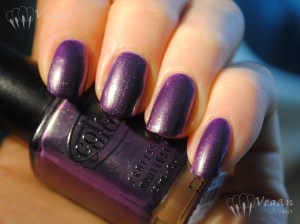
Color Club Port-folio

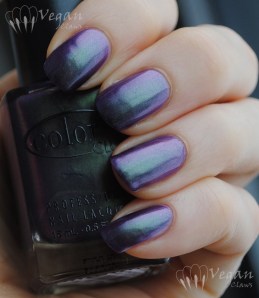
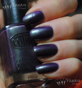
Here’s another polish from last fall – Color Club Port-folio from the In True Fashion collection. This is a great purple with duochrome green/pink shimmer. First photo is under a halogen lamp.

Color Club Port-folio

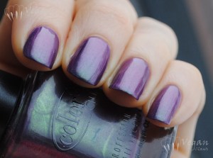
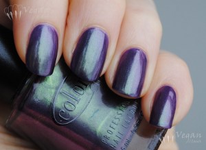
Shown are two coats (three on a couple of nails where I had bald spots). Next three photos in overcast natural light:

Color Club Port-folio

Color Club Port-folio

Color Club Port-folio

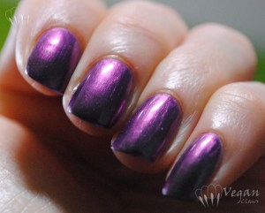
The formula on this one is good, but a little care does need to be taken to get the brush strokes straight (they’re much less noticeable after it dries, though). The last two photos are under the Ott Light, and the first one really shows the fuchsia-pink shift of the duochrome.

Color Club Port-folio

Color Club Port-folio

I was afraid I might not like this one on me, since I don’t really care for dark purple/green duochromes on myself (I like them on others though), but I *love* this medium purple one!

Zoya Evvie, Katherine, and Rekha

These three polishes are from Zoya’s fall 2012 Designer and Gloss collections, although all three were part of last spring’s New York Fashion Week limited edition releases as well, and that’s when I got them.

Zoya Evvie with No Miss Peacock

Evvie is a dark, dusty grey-leaning green creme. It was originally released in the Peter Som collaboration trio. This is a great colour; I loved wearing it. Shown are two coats plus top coat, and the formula was good.

Zoya Evvie with No Miss Peacock

On my index finger, I have a coat of No Miss Peacock Glitter over Evvie. Peacock is a green and blue glitter polish with small rectangular shaped glitters, almost like bar glitter cut in half.

Zoya Evvie with No Miss Peacock

Next is Katherine, a deep plum/eggplant purple jelly that was also originally from the Peter Som trio.

Zoya Katherine

It’s a very transparent sort of jelly; this first photo is three coats over a ridge filling base coat. At the time I swatched this I had a fiberglass wrap on my index finger, and it still shows a bit through the polish. Gloss is a good name for the collection Katherine comes from – there’s no top coat here, the shine is all Katherine.

Zoya Katherine

These other two photos show four coats of Katherine. She has a very nice jelly formula, and will make great jelly sandwiches. I decided to leave my index and its wrap out of the last photo. πŸ˜‰

Zoya Katherine

And finally, Rekha, a red semi-jelly shade that was originally from Zoya’s Bibhu Mohapatra collaboration trio. I believe it was named after the designer’s mother, and recreates the shade of red nail polish that she wore.

Zoya Rekha

Only two coats are needed, but I’m wearing three in these photos because I applied the polish before going to bed and didn’t use a quick-dry top coat, so unsurprisingly by the time I took photos in the morning there were some little scratches on the surface.

Zoya Rekha

Rekha seems to me a very neutral shade of red, neither cool nor warm, and is a great version of a classic colour. Here she is in the shade:

Zoya Rekha

OPI Don’t Talk Bach to Me and Glow Up Already, and a franken

I’m trying something new today! I downloaded an app to add watermarks to photos on my phone, so that I can actually post pictures I’ve taken with my phone straight from my phone without having to forego the watermark (stupid WordPress app doesn’t allow access to the blog’s media library, which is another related problem). It’s kind of neat because with this app the size, orientation and placement of the watermark can also be changed unlike the software I normally use on my laptop. Only thing I don’t like is that there’s no option that I can see to change the name of the image file, so the photos just have numbers for names and that can only be changed using the full WordPress site…

20121122-154829.jpg

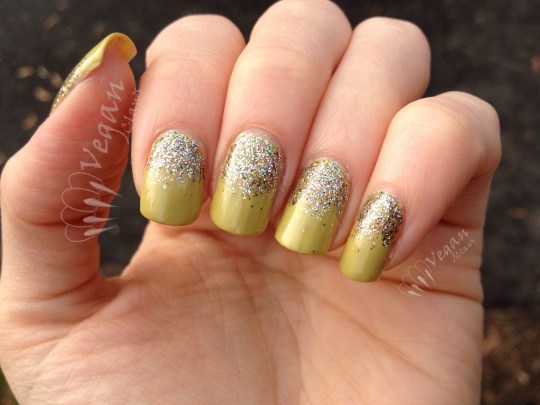
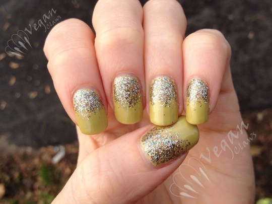
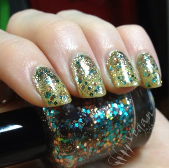
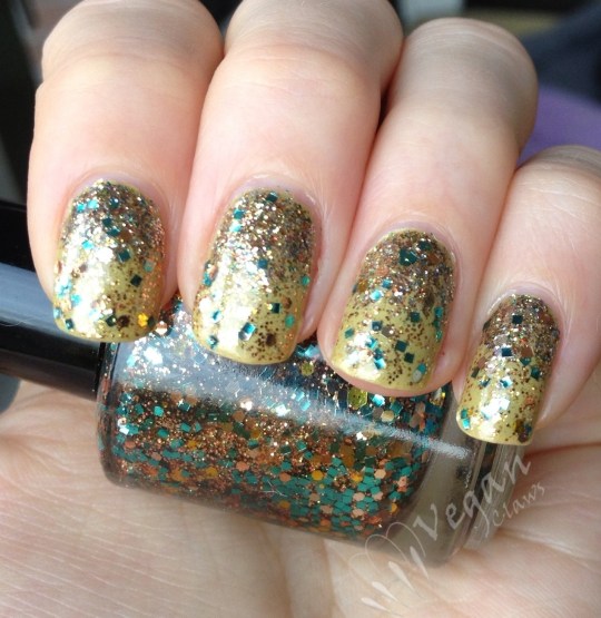
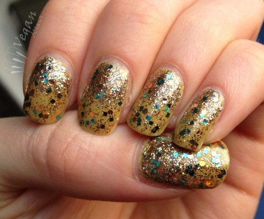
Anyway, here’s a mani! πŸ™‚ This is OPI Don’t Talk Bach to Me from the Germany collection, with a glitter gradient of OPI Glow Up Already from the Burlesque collection, and Poshe topcoat over everything. Photos in natural overcast light.

20121122-154924.jpg

I used two coats of Don’t Talk Bach to Me, a light yellow-green with a creme base and some slight shimmer, and I found the formula kind of thick. I’ll probably add some thinner before using it again.

20121122-155027.jpg

Glow Up Already is a dense fine glitter in a lot of colours, especially gold, green, and orange, with an overall look of golden lime green.

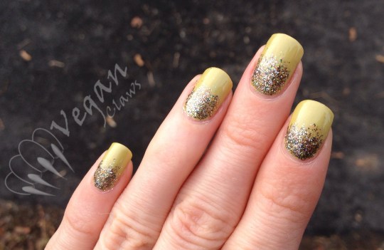
The next day, I added two coats of a frankenpolish that I made which contains teal square glitter, yellow, copper and champagne gold hex glitter, and gold glass flecks. Under my Ott light:

20121125-100733.jpg

The main polishes I used were Kleancolor Tiara Gold, LA Girl Glitter Addict in Flashy, NYX salon formula 24K Glitter, and Wet n Wild The Gold and the Beautiful. Overcast natural light:

20121125-100756.jpg

The teal square glitter was from Glitter Unique, if I recall correctly. This last photo is in partially sunny natural light:

20121125-100822.jpg

I’m really happy with how this franken turned out! πŸ™‚

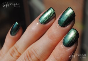
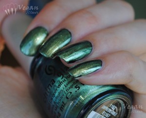
China Glaze Unpredictable

Today I have another duochrome from China Glaze’s New Bohemian collection to show you! The first two polishes I reviewed from the collection are here.

China Glaze Unpredictable

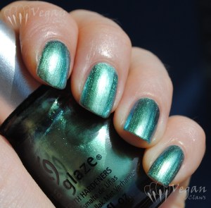
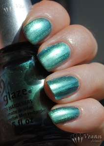
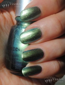
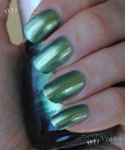
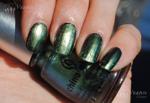
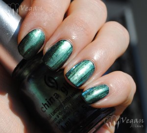
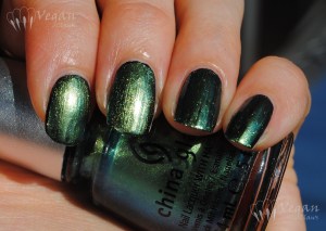
This is Unpredictable, a metallic green/teal duochrome. Like the other polishes in the collection, the metallic finish is slightly brushstrokey but not so much that it really qualifies as “frost”.

China Glaze Unpredictable

Shown are three coats, but I probably could have gotten away with two. No issues with application other than taking a bit of care to get the brushstrokes straight. Here you can see that head-on, the leaf-green aspect is prominent, whereas the above photos at a bit more of an angle show off the teal side of the polish.

China Glaze Unpredictable

In the shade:

China Glaze Unpredictable

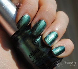
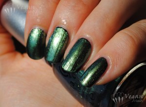
The rest of the photos show one coat of Unpredictable over one coat of Kleancolor Black, deepening the overall effect. As usual lately, please disregard any lumps in the too-thick base polish!

China Glaze Unpredictable over black

China Glaze Unpredictable over black

China Glaze Unpredictable over black

China Glaze Unpredictable over black

China Glaze Unpredictable over black

China Glaze Unpredictable over black

In the shade:

China Glaze Unpredictable over black

This polish didn’t disappoint; I think the duochrome is quite apparent and the two green tones are really nice!

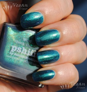
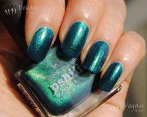
Picture Polish Pshiiit

I recently learned that Australian brand Picture Polish is vegan-friendly, so of course I had to buy some of their polishes to try them out!

Picture Polish Pshiiit

This beauty is a brand-new shade called Pshiiit, as it was a collaboration with French web-store owner and blogger Camille of Pshiiit. Picture Polish recently did several collaboration shades with e-tailers in their distribution network, and I’ll also have swatches of a couple of the others soon.

Picture Polish Pshiiit

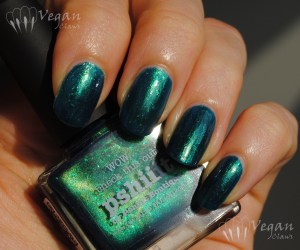
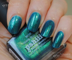
Pshiiit is a teal jelly with flakies and lots of fine gold shimmer as well as some microglitter thrown in. Gorgeous! I recommend clicking on the photos to see all the detail of the finish in the larger versions!

Picture Polish Pshiiit

I found the formula had a little of the thin-yet-thick thing going on, but didn’t have trouble with it and a second, thick coat evened everything out. This could easily be worn as a layer over a creme polish for those who don’t like visible nail lines.

In the shade:

Picture Polish Pshiiit

Love it! Great job, Camille and Picture Polish! πŸ˜€

China Glaze Deviantly Daring and No Plain Jane

I’ve got the first two of six new China Glaze polishes from their New Bohemian collection today! These shades have duochrome to varying degrees, and a metallic finish that’s slightly brushstrokey but not in a bad way, in my humble opinion – I wouldn’t quite call them frost, and I didn’t have trouble getting the brush stokes straight.

I’ll start with No Plain Jane, the purple shade; I was actually a little disappointed with this one since the duochrome didn’t seem as orange as I expected; more of a pinkish-goldenish-copper shade, and the purple can look paler and almost lavender inΒ some lighting. This swatch is three coats, and I found the formula a bit thick and sticky for this kind of polish. First photos are in sunlight:

China Glaze No Plain Jane

China Glaze No Plain Jane

China Glaze No Plain Jane

These next photos are under my Ott Lite:

China Glaze No Plain Jane

China Glaze No Plain Jane

Next I layered one coat of No Plain JaneΒ over KleancolorΒ Black.Β Layered this way, itΒ photographed bluer than it is – it’s definitely more of a red-leaning purple like the first photos showed. Sunlight:

China Glaze No Plain Jane over black

China Glaze No Plain Jane over black

China Glaze No Plain Jane over black

This one is a bit more colour accurate:

China Glaze No Plain Jane over black

In indirect natural light:

China Glaze No Plain Jane over black

Next is Deviantly Daring; I love this rich teal-blue-green shade! Two coats shown here, and this one had a great formula. Sunlight:

China Glaze Deviantly Daring

China Glaze Deviantly Daring

China Glaze Deviantly Daring

In the shade, if you click to enlarge this photo you can kind of see the fine gold shimmer that gives this polish extra depth; it’s more visible in the bottle than on the nail but is really pretty:

China Glaze Deviantly Daring

This next photo is under the Ott Lite – I think that bright green flash that you can see near the bottom right of each nail is actually a reflection from the wall with its bright lime-green paint job, so I’m a little hesitant to post this, but I guess I’ll just say that this one isn’t totally accurate of what the polish looks like in real life!

China Glaze Deviantly Daring

Now, here is one coat of Deviantly Daring over one coat Kleancolor Black, in sunlight:

China Glaze Deviantly Daring over black

China Glaze Deviantly Daring over black

China Glaze Deviantly Daring over black

China Glaze Deviantly Daring over black

China Glaze Deviantly Daring over black

In shade:

China Glaze Deviantly Daring over black

So, one of these two polishes was nice but mainly just “okay” in my opinion, and the other is a definite winner! The other four shades from this collection are on my ever-expanding “to swatch” list!

Misa Skinny Dipping and Comparison

Skinny Dipping is the second of two polishes I got from Misa’s Hot Summer collection for summer 2012. It’s a gorgeous neon aqua shade with blue shimmer!

Misa Skinny Dipping

The polish was fairly sheer; I think the sheerness helps add depth with the shimmer though. I used three coats here.

Misa Skinny Dipping

The consistency was a little thin on the first coat, but seemed less so by the third coat (that’s probably the effect of the humidity that day…).

Misa Skinny Dipping

The polish dries to a satin finish due to the neon pigment in it. I didn’t use any top coat for these photos, so as you can see it’s definitely not totally matte.

Misa Skinny Dipping

I really love the blue shimmer in this! In the shade:

Misa Skinny Dipping

This polish is quite unique, at least in my collection. I did a comparison to the most similar polish I have, Color Club Wicked Sweet (which itself is basically a dupe of Color Club Pure Energy; that reminds me I have some old posts still waiting in the archives that I should really get around to posting some day!). Left to right, Wicked Sweet, Skinny Dipping, Wicked Sweet, Skinny Dipping:

Misa Skinny Dipping and Color Club Wicked Sweet

These two polishes are kind of like opposites – Wicked Sweet is blue with turquoise shimmer, and Skinny Dipping is turquoise with blue shimmer!

Misa Skinny Dipping and Color Club Wicked Sweet

I also used three coats of Wicked Sweet, although it wasn’t quite as sheer as Skinny Dipping. This next photo really shows off the difference in the base colours:

Misa Skinny Dipping and Color Club Wicked Sweet

Another big difference between the two is that Wicked Sweet is scented; it has a blueberry-candy scent to it.

Misa Skinny Dipping and Color Club Wicked Sweet

I like how these two complement one another!

Zoya Beach Skittles

Today I have a skittle mani to show you, using the polishes from Zoya’s Beach collection for summer 2012.

Thumb to pinkie: Zoya Reagan, Wednesday, Shelby, Arizona, Lara. Bottle: Zoya Tracie

Thumb to pinkie are Zoya Reagan, Wednesday, Shelby, Arizona, and Lara. The bottle I’m holding is Zoya Tracie, the only non-creme polish from Beach.

Thumb to pinkie: Zoya Reagan, Wednesday, Shelby, Arizona, Lara. Bottle: Zoya Tracie

I plan on doing comparison posts for all of these polishes later, so I’m not going to talk much about the formulas right now. These swatches were all two coats, though.

Thumb to pinkie: Zoya Reagan, Wednesday, Shelby, Arizona, Lara. Bottle: Zoya Tracie

Some shade photos:

Thumb to pinkie: Zoya Reagan, Wednesday, Shelby, Arizona, Lara. Bottle: Zoya Tracie

Thumb to pinkie: Zoya Reagan, Wednesday, Shelby, Arizona, Lara. Bottle: Zoya Tracie

Thumb to pinkie: Zoya Reagan, Wednesday, Shelby, Arizona, Lara. Bottle: Zoya Tracie

Later on, I added a coat of Sally Girl Way2Disco, a blue-teal iridescent glitter (shown here in the shade, since the sun was not cooperating):

Index to pinkie: Zoya Wednesday, Shelby, Arizona, Lara, topped with Sally Girl Way2Disco

Thumb to pinkie: Zoya Reagan, Wednesday, Shelby, Arizona, Lara, topped with Sally Girl Way2Disco

Stay tuned for comparisons of the Beach (and Surf, the other half of the collection!) polishes to other similar polishes in my stash! I hope to get those posts started in the near future.

LA Girl Chromium Green

LA Girl Chromium Green

Today I have a polish from the LA Girl Metals collection to show you. This is Chromium Green, a greenish turquoise foil polish. These overcast photos make it look bluer than it really is, although only a little – I don’t think I would have named it “Green” myself, it’s really more of a turquoise or aqua.

LA Girl Chromium Green

The formula on this is beautiful, easy to apply. Shown are two coats in overcast natural light.

LA Girl Chromium Green

The only hassle with this is that on removal you tend to get little silvery foil bits stuck to your fingers, the usual hazard of foil polishes! But washing hands after removal will generally take care of them. πŸ™‚

LA Girl Chromium Green

Color Club Metamorphosis and comparison

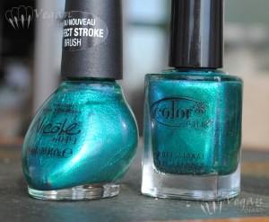
Today I have Color Club Metamorphosis to show you, and a comparison to Nicole by OPI Iceberg Lotus which I previously blogged about here. These two are very close dupes!

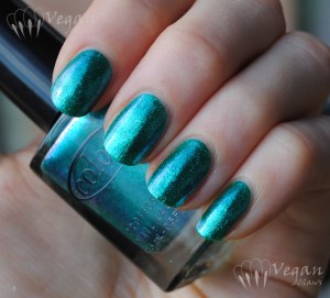
Metamorphosis is from Color Club’s recently released Take Wing collection for summer 2012. It’s a teal glass-fleck with blue/violet duochrome.

Here it is at two coats in natural overcast light. Formula was great.

Color Club Metamorphosis

Color Club Metamorphosis

Color Club Metamorphosis

And here are the two polishes side-by-side in the bottle.

Color Club Metamorphosis and Nicole by OPI Iceberg Lotus

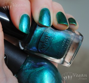
On the nail, two coats each. Index and ring are Metamorphosis, middle and pinky are Iceberg Lotus. The only difference I saw is that Metamorphosis is slightly denser/more opaque.

Color Club Metamorphosis and Nicole by OPI Iceberg Lotus

Color Club Metamorphosis and Nicole by OPI Iceberg Lotus

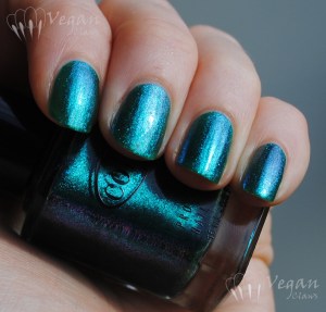
Two coats each over one coat of Kleancolor Black, again index and ring are Metamorphosis, middle and pinky are Iceberg Lotus. It doesn’t really show in the pictures, but Iceberg Lotus seemed to show very slightly more duochrome, probably because it’s slightly more sheer.

Color Club Metamorphosis and Nicole by OPI Iceberg Lotus, over black

Color Club Metamorphosis and Nicole by OPI Iceberg Lotus, over black

Color Club Metamorphosis and Nicole by OPI Iceberg Lotus, over black

Color Club Metamorphosis and Nicole by OPI Iceberg Lotus, over black

So there you have it; I’d say these are definitely dupes! Good thing they’re awesome! πŸ˜€